Client: Barbara Allen’s Media and Electoral Politics Class
Fall 2018
End Product: 3-D AR Visualization App
Overview:
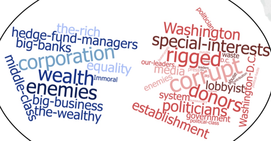
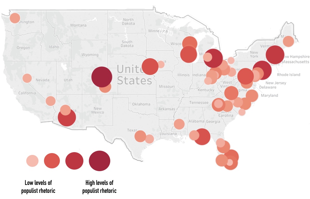
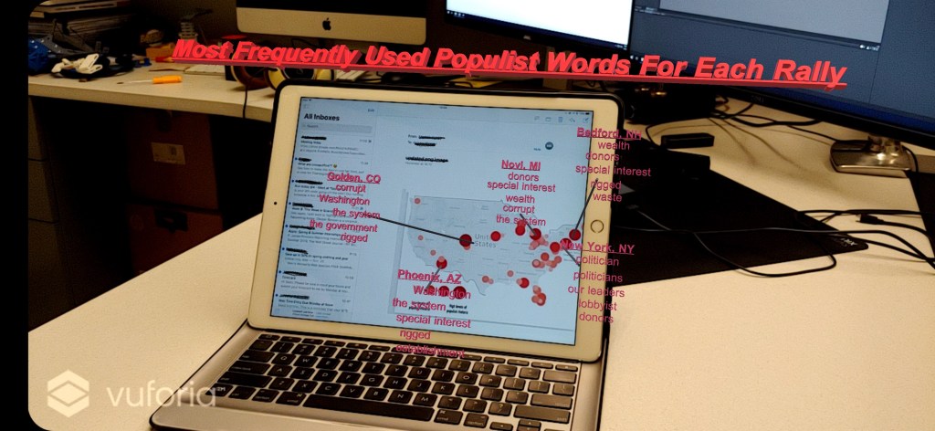
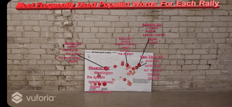
I was taking a class called Media and Electoral Politics with Professor Barbara Allen Fall 2018. My group investigated the use of populist rhetoric in Donald Trump’s presidential rally speeches and made an infographic to show where his use of populist rhetoric was most prevalent. I wanted to add an additional layer to the infographic to show which populist words he used and how it varied by rally. This is what I came up with.
Project Specifications:
The map infographic (see below) was used essentially as a QR Code. When the camera detected the infographic target, the words and lines popped out. The challenge was incorporating the most popular words in campaign speeches (see word clouds below) with the map infographic in a meaningful way.
Our final product combined these two specifications (map infographic and most popular words in campaign speeches overall) to reveal geo-specific word popularity in our final product.
The final app was developed using Vuforia and Unity.